

Email marketing still gives one of the highest returns in online marketing. Many reports continue to show strong ROI from email campaigns, but weak CTAs often reduce clicks, signups, and sales. A good subject line may get the open, but the CTA decides whether readers take action or leave. That is why the debate around email CTA buttons vs text links matters so much in 2026. This guide explains the real difference between buttons and text links using simple examples, user behavior research, and practical email design rules. You will also learn how brands use A/B testing tools like Aurora SendCloud to improve click-through rates and conversions.
Why CTA Design Matters in Email Marketing
A strong CTA moves readers from interest to action. In most email campaigns, the CTA is the final step in the conversion process. If the CTA feels confusing, hidden, or weak, users stop before converting.
The AIDA model explains this clearly:
- Attention
- Interest
- Desire
- Action
The CTA handles the “Action” stage. That means your CTA design directly affects clicks, purchases, signups, downloads, and demo requests. A clear visual hierarchy email CTA structure helps readers notice the most important action first. If every link looks equally important, users feel overwhelmed and delay decisions. This connects closely with cognitive load theory. The more choices people see, the harder it becomes to act. Too many buttons, links, banners, and offers often reduce conversions instead of improving them.
Email CTA Buttons vs Text Links: Understanding the Core Difference
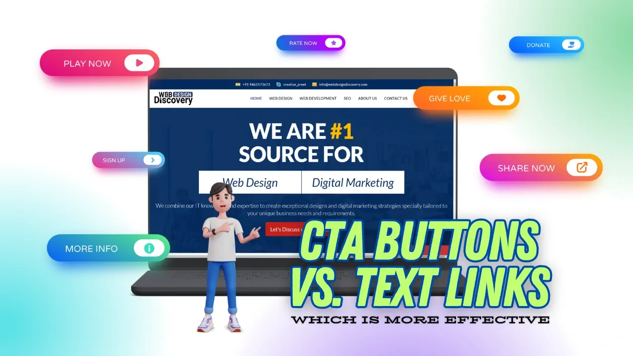
The discussion around email CTA buttons vs text links is not about which option is always better. The real goal is understanding when each format works best. Buttons usually perform better for primary actions because they stand out visually. Text links work better when you want softer engagement without interrupting reading flow.
Why CTA Buttons Work Well for Primary Actions
Buttons attract attention immediately. Their shape, color, and spacing separate them from normal content. This visual break helps users identify the next step quickly. One major reason buttons work well in CTA design email marketing is affordance psychology. People naturally understand that a raised or colored button is clickable. The design itself signals action. Mobile behavior matters too. On phones, users tap with thumbs, not mouse cursors. Larger buttons create easier tap targets and reduce accidental clicks. This improves user experience and often increases conversions.
Buttons work best for:
- Purchases
- Signups
- Demo bookings
- Free trials
- Checkout actions
- Limited-time offers
When discussing email CTA buttons vs text links, buttons usually win for direct conversion goals.
Why Text Links Still Matter in Email Campaigns
Text links feel more natural inside paragraphs. They do not interrupt reading flow the same way buttons do. Because of this, they often work well for informational or secondary actions. Text links also create lower psychological pressure. Some readers avoid large buttons because they feel too sales-focused. A subtle hyperlink inside useful content can feel more trustworthy. This is where email call to action psychology becomes important. Readers react differently depending on intent. Someone reading a newsletter may prefer educational links instead of strong conversion-focused buttons.
Text links work well for:
- Blog articles
- Supporting resources
- Terms and policies
- Product details
- Educational content
- Secondary navigation
In many campaigns, the best approach is not choosing one over the other. Instead, smart marketers combine both formats carefully with email templates.
The Psychology Behind Effective Email CTAs
The performance of email CTA buttons vs text links depends heavily on psychology. Small design choices affect attention, memory, trust, and decision-making.
The Von Restorff Effect
The Von Restorff Effect explains that people remember items that stand out visually. A button with strong contrast naturally attracts more attention than plain text. This is one reason buttons often improve click-through rates in promotional campaigns. If every part of the email uses bright colors, though, the effect disappears. The CTA must remain visually distinct. This principle strongly affects visual hierarchy email CTA planning.
Hick’s Law and Decision Fatigue
Hick’s Law states that more choices increase decision time. Many marketers damage conversions by adding too many equal CTAs inside one email. Readers hesitate because they cannot decide where to click. Good CTA design email marketing keeps the focus clear. One strong primary CTA usually performs better than five competing options.
For example:
Bad approach:
- Buy Now
- Learn More
- Explore Features
- Watch Demo
- Compare Plans
Better approach:
- One main button
- One supporting text link
Simple layouts reduce friction and improve clicks.
Gestalt Principles in CTA Design
Gestalt psychology explains how people visually group elements together. Spacing and proximity influence attention. If a CTA sits too close to unrelated content, readers may ignore it. If whitespace surrounds the CTA, users recognize its importance more quickly. Figure-ground contrast matters too. Buttons need clear separation from the background so they remain easy to notice. This is another reason why visual hierarchy email CTA design matters so much in modern campaigns.
Color Psychology and User Behavior
Color changes emotional reactions. Different CTA colors create different feelings:
- Red often signals urgency
- Blue creates trust
- Green suggests progress or confirmation
- Orange creates energy and visibility
There is no universal “best” CTA color. The real goal is contrast against the email background.
Strong contrast helps buttons stand out while keeping the email easy to scan and rendering properly.
CTA Copy Psychology
Words matter just as much as design. Strong action verbs increase engagement because they clearly explain the next step. Weak phrases reduce clarity and motivation.
Poor examples:
- Click Here
- Submit
- Learn More
Better examples:
- Start Free Trial
- Get Pricing
- Download Guide
- Book Demo
Good CTA copy reduces uncertainty. Readers should instantly understand what happens after clicking. This is a key part of email call to action psychology and writing marketing emails.
Aurora SendCloud A/B Testing Case Study
A SaaS brand recently tested email CTA buttons vs text links in a product onboarding campaign. The company wanted to improve click-through rates without changing the email copy itself. Version A used a plain text hyperlink inside the email body. Version B used a high-contrast CTA button placed near the top section of the email. The result showed a 27% higher click-through rate for the button version. The marketing team used Aurora SendCloud Documentation to run the A/B test and track user behavior.
The test revealed several useful findings:
- Mobile users clicked buttons more often
- Early CTA placement improved engagement
- High contrast increased visibility
- Short CTA text improved readability
This example shows why testing matters. Some audiences respond better to buttons, while others prefer softer text-based CTAs. Instead of guessing, marketers should test different layouts regularly with email testing tools.
Best Practices for Email CTA Design
The best CTA design email marketing strategies focus on clarity, spacing, and user intent. Small improvements often create noticeable conversion gains.
Best Practices for CTA Buttons
Buttons should remain simple and easy to scan.
Important button guidelines include:
- Keep text between 3–4 words
- Stay under 25 characters
- Use high contrast colors
- Add generous whitespace around buttons
- Place important buttons above the fold
- Keep button width mobile friendly
Buttons should also stay readable on smaller screens. Multi-line button text often looks broken and confusing on phones. For mobile usability, aim for at least a 44x44px tap target. These small details improve both accessibility and conversions and email device usage insights.
Best Practices for Text Links
Text links need clear styling so readers recognize them instantly.
Good practices include:
- Use short anchor text
- Keep links between 2–5 words
- Use blue or contrasting link colors
- Underline links for clarity
- Avoid bold styling for regular hyperlinks
When using email button vs hyperlink strategies, remember that hyperlinks should support the content naturally instead of competing with the primary CTA. Linking descriptive keywords also helps readers understand the destination page before clicking.
Mobile-First CTA Design Matters More Than Ever
Most email opens now happen on mobile devices. That means email CTA buttons vs text links discussions must include mobile behavior. Buttons generally perform better on phones because they are easier to tap. Tiny text links can frustrate users, especially inside crowded paragraphs. Spacing matters heavily on smaller screens. Buttons placed too close together increase accidental taps and reduce usability.
Mobile-friendly CTA design should focus on:
- Large tap targets
- Clear spacing
- Short CTA copy
- Strong contrast
- Easy scrolling flow
Ignoring mobile optimization often hurts click-through rates, even when desktop layouts look perfect. Make sure to optimize for email template compatibility.
The Hybrid Strategy: Using Buttons and Text Links Together
Many successful campaigns combine both CTA formats instead of choosing only one.
This hybrid method works well because it creates a clear visual hierarchy while still offering supporting resources.
The common strategy looks like this:
| Scenario | Recommended CTA |
|---|---|
| Purchase or signup | Button |
| Newsletter content | Text link |
| Limited-time offer | Button |
| Supporting information | Text link |
| Multiple CTA email | One button + text links |
This structure reduces confusion while giving readers additional options when needed.
In many campaigns, the strongest setup includes:
- One main CTA button
- Several supporting text links
This approach keeps the email organized without overwhelming users.
Common CTA Mistakes That Hurt Conversions
Many email campaigns fail because of avoidable CTA mistakes. One major issue is vague wording. Generic phrases like “Click Here” provide no motivation or clarity. Another common problem involves equal visual weight. If every button uses the same size and color, readers struggle to identify the main action. Mobile formatting errors create additional problems. Buttons with multi-line text often look broken or difficult to tap.
The most common mistakes include:
- Weak CTA wording
- Too many competing CTAs
- Low contrast buttons
- Tiny mobile tap targets
- Linking to irrelevant pages
- Poor whitespace around buttons
Fixing these issues usually improves click performance quickly and helps with avoiding email marketing mistakes.
Final Thoughts on Email CTA Buttons vs Text Links
The debate around email CTA buttons vs text links does not have one universal answer. The best choice depends on user intent, campaign goals, device behavior, and content structure. Buttons usually work better for direct conversion actions because they attract attention and simplify decisions. Text links work better for softer engagement and supporting content. Strong email call to action psychology depends on clarity, visual hierarchy, spacing, and focused messaging. Small changes often create meaningful improvements in engagement and conversions.
The smartest approach is consistent testing. Tools like Aurora SendCloud help marketers compare layouts, CTA placement, colors, and wording to discover what works best for their audience and ensure email deliverability.