You open your inbox. Three promotional emails sit side by side. One is a wall of tiny text. Another has broken images and a button you cannot tap. The third is clean, readable on your phone, and makes it obvious what to click next. You know which one wins. Email design is not decoration. It is the science of organizing information so eyes move naturally toward action.
A 2025 analysis found plain-text-style emails get 28% higher click-through rates than heavily branded HTML designs—not because design does not matter, but because clarity guides the click. Whether you have never touched an email builder or have muddled through without much confidence, this post gives you the steps, the rules, and the shortcuts to design professional, responsive marketing emails that drive results.
Foundational Knowledge – Key Elements of Email Design
Before you open any editor, you need to recognize the building blocks every marketing email depends on. These elements shape how your reader processes your message and what they do next.
Core Modules
Every email, from a simple SaaS update to a complex ecommerce promotion, uses the same structural modules. A header with your logo anchors brand recognition at the top. A hero image or headline section draws the eye in and sets the tone. The body content area carries your main message. A call-to-action area tells recipients what to do. A footer with an unsubscribe link keeps you legal and trusted. When all five modules work together, the reader does not get stuck wondering where to look.
Visual Hierarchy
Visual hierarchy is about guiding the eye. The most important element—usually your headline or hero image—should dominate visually. Subheadings break the body text into scan-friendly chunks. Your CTA button needs a distinct color and enough white space around it that it cannot be missed. Without hierarchy, readers scan indiscriminately and leave quickly. With it, they follow a path you have intentionally built.
Brand Consistency
Your email should feel like it comes from the same company as your website and product. Use your brand's primary typeface if your platform supports web fonts, or fall back to a widely available system font like Arial or Helvetica. Stick to a tight color palette—one or two brand colors, a neutral background, and dark text. When your email looks consistent with your other touchpoints, recipients recognize you instantly and trust climbs.
Responsive Design
Over 60% of emails now open on mobile devices. A responsive email adapts its layout to the screen it appears on. Single-column layouts work best because they reflow naturally on phones. Body text should start at 14px and go up to 16px for comfortable reading. Buttons need a touch target of at least 44×44 pixels so thumbs can tap them without frustration. If your email breaks on a phone, your reader deletes it in seconds.
Starting from Scratch – How to Design Your First Email on Aurora SendCloud
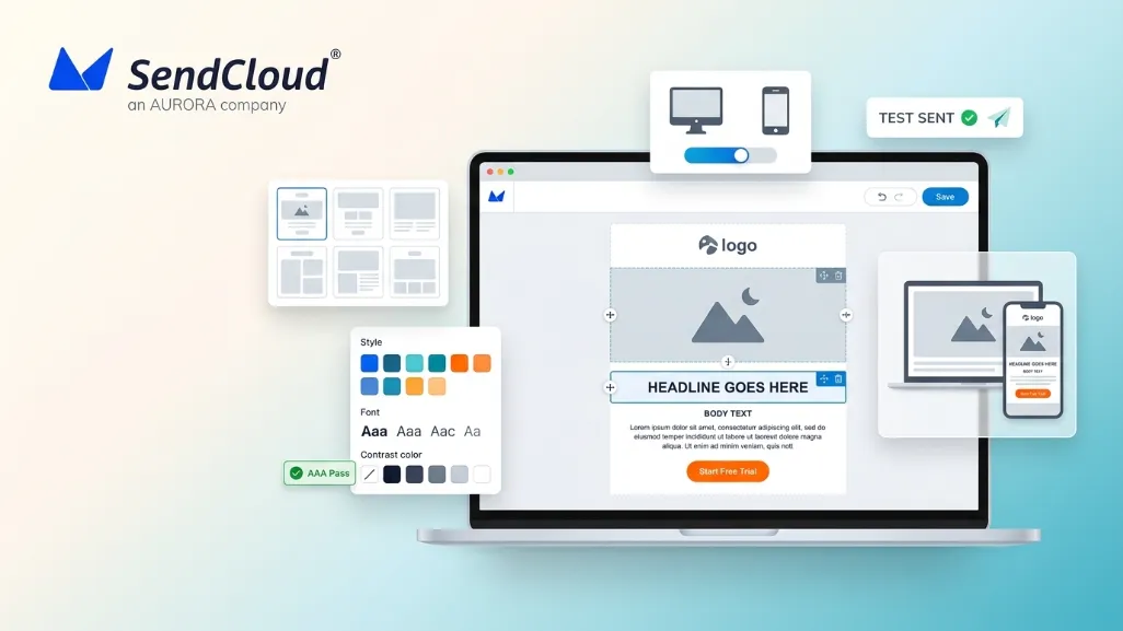
The fastest way to build confidence is to open an editor and build a real email. Aurora SendCloud gives you a drag-and-drop builder where you can pick a template, customize every module, and test before you send.
Step One: Choose and Customize a Template
Jump into the Aurora SendCloud email editor. Browse the template library and pick one that matches your goal—a product announcement, a newsletter, a welcome series. Templates give you a pre-built structure with all the core modules in place, so you are not staring at a blank canvas. Hover over options to preview layouts, then select one and open it in the drag-and-drop editor.
Step Two: Fine Tune Your Design with the Drag-and-Drop Editor
Once your template loads, you see a visual canvas with blocks you can move, add, or remove. The editor uses a modular system: text blocks, image blocks, button blocks, divider lines, social icons, and more.
- Module operations. Click any text block to type your own copy. Replace placeholder images with your own product shots or illustrations. Delete modules you do not need, or duplicate ones you want to repeat—like a CTA button you want to appear twice.
- Style adjustments. Select any module and use the settings panel to change background colors, padding, and borders. For text, pick your font family, size, color, and line height. A line height of 1.5 to 1.6 keeps paragraphs readable without feeling cramped.
- Links and buttons. Highlight text and add a hyperlink, or select a button block and enter your destination URL. Make button text action-oriented: "Get the Guide" or "Start Free Trial" instead of "Click Here."
Step Three: Crucial Preview and Testing
Before any email goes to your list, check how it renders. Aurora SendCloud includes a preview mode that shows how your email looks on desktop and mobile. Use it to spot alignment glitches, broken images, or buttons that feel too small. Then send a test email to your own inbox and open it on a phone and a laptop. Click every link. Check load times. Read your copy out loud. This five-minute check catches issues that would otherwise cost you engagement on launch day.
Advanced Email Design Best Practices
Once you can build a basic email, a few advanced rules will lift your results—often by double-digit percentages.
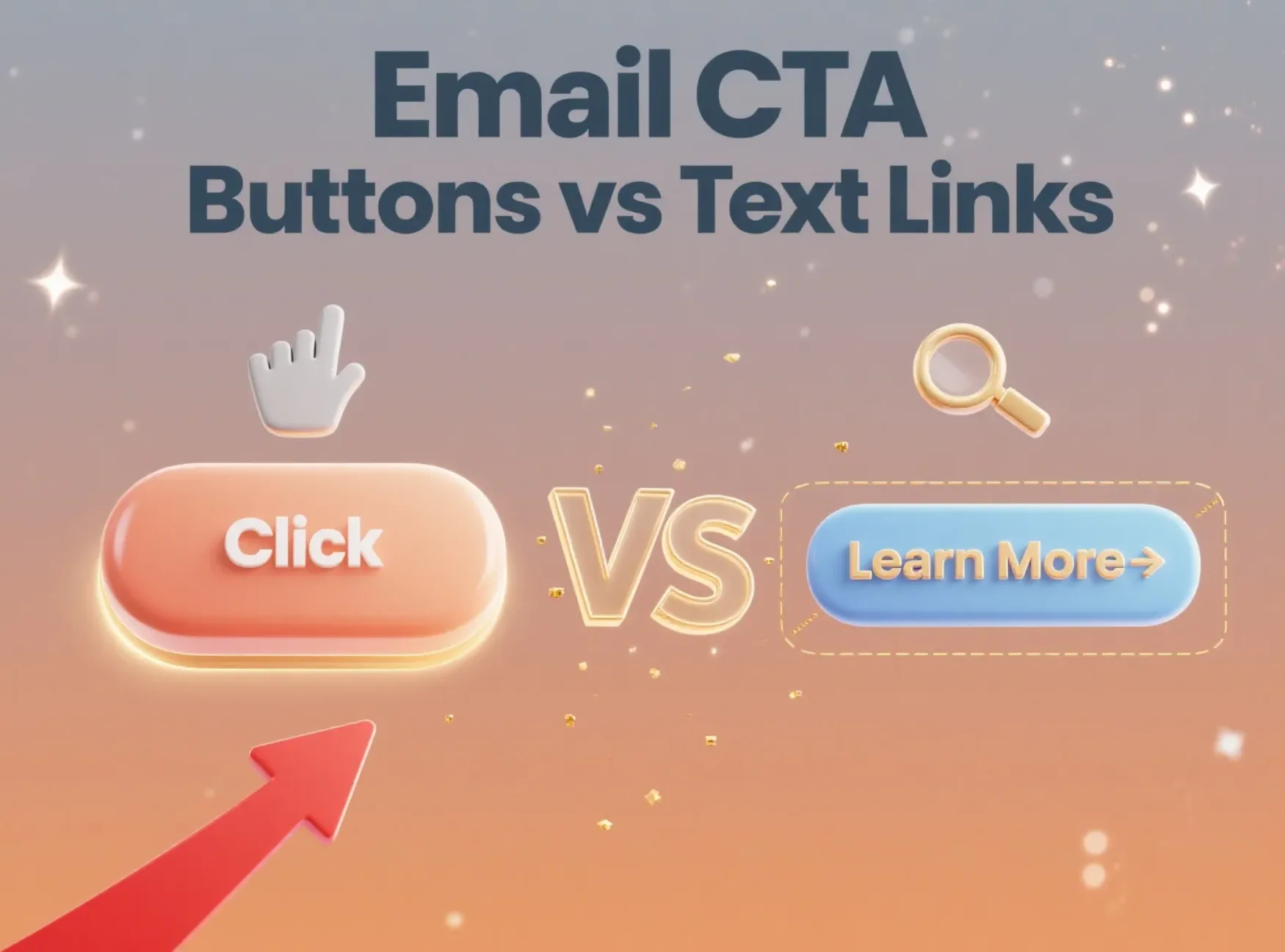
CTA Button Design Golden Rules
Your CTA button is the highest-stakes element in your email. Color matters only insofar as it contrasts sharply with the surrounding design. A red button on a blue-dominant email outperforms a blue button on the same email because of contrast, not because red is magically better. The button must be at least 44 pixels tall for mobile taps. Place your primary CTA above the fold—the part of the email visible before scrolling. If you are including a secondary link, make it a text link, not a second button competing for attention.
Balance Between Images and Text
Spam filters still flag emails that are one giant image with almost no visible text. The standard recommendation is a 60:40 text-to-image ratio: at least 60% real text and no more than 40% image area. Real text means live HTML text, not words embedded inside a graphic. Add descriptive alt text to every image so screen readers and image-blocked inboxes still understand your message. Keeping image file sizes under 200KB helps emails load fast, especially on mobile connections.
Simplicity is Sophistication
Brands that send stripped-back, personal-feeling emails often outperform busy designed campaigns. A plain-text-style message with a single column, one clear CTA, and minimal branding can lift click-through rates by 28%. This does not mean "never design anything." It means that every design element you add should earn its place by supporting your primary goal. If removing a decorative image or an extra column makes the CTA more obvious, remove it.
Accessibility Considerations
Digital accessibility is now a legal requirement in the EU under the European Accessibility Act. But beyond compliance, accessible emails perform better for everyone. WCAG 2.1 Level AA guidelines recommend a minimum color contrast ratio of 4.5:1 for body text and 3:1 for large text. Use larger font sizes—16px minimum for body copy. Left-align text rather than center-aligning long paragraphs, which is harder for dyslexic readers to track. Provide a plain-text version of every campaign. Include descriptive alt text for all images. These small habits widen your audience and simultaneously improve deliverability.
Excellent Email Design Examples
Here are three real-world email types with design decisions beginners can borrow.
Ecommerce Promotion Email
A typical ecommerce promo email opens with a bold headline—"30% Off Ends Tonight"—followed by a grid of product images with prices and short labels. Each product image links to its store page. A single, high-contrast CTA button near the top says "Shop the Sale." The footer keeps required legal text and unsubscribe links tidy. Key lesson: one hero offer, multiple visual entry points, and zero friction to purchase.
SaaS Product Update Notification
A SaaS update email starts with your logo and a clean headline summarizing the new feature. Below it, a screenshot or short animated GIF shows the feature in action. A paragraph or two of text explains the value to the user. The CTA button says "Try It Now" and links directly to the feature inside the app. White space and a single column keep the email fast to read. Key lesson: show, do not just tell—and link straight to the value.
Brand Newsletter
Newsletters work best with a simple structure: a header image or illustration, a short editorial intro, and then three to five article previews—each with a thumbnail, a title, and one sentence of context. Read-more links sit under each preview. The overall text-to-image ratio stays around 60:40. Key lesson: curate. Do not dump every possible link into one email. Choose the content that serves your reader's goals, not just your publishing schedule.
FAQ
Can I use animated GIFs in emails? Does it affect deliverability?
Yes, you can use animated GIFs, and most modern email clients support them. Outlook 365 plays them, though older Outlook versions show only the first frame as a static image. The deliverability risk comes from file size, not the format itself. Keep GIFs under 1 MB and test across clients. Always include fallback text or a static alternative frame so nothing breaks for recipients whose clients strip animation.
When A/B testing design variants, which elements should I primarily test? How long is a scientifically sound testing period?
Test one design element at a time: button color, button copy, image placement, or headline font size. Run the test for at least 3 to 7 days so you capture engagement across different days of the week. Split your audience evenly and let the data declare a winner before rolling it into your standard template.
To ensure a good mobile experience, what are the recommended image sizes and overall email width?
Keep the overall email width at 600 to 640 pixels. Hero images work well at 600px wide. Smaller inline images and thumbnails can sit at 150 to 300px wide. Always compress images—aim for under 200KB per image—so mobile load times stay fast.
Conclusion: Design Makes Every Communication More Valuable
Strong email design is not about being an artist. It is about removing friction so your message lands, reads easily, and drives action. Start with a template. Lay out the five core modules. Build visual hierarchy with clear headlines, readable type, and high-contrast buttons. Keep your image-to-text ratio around 60:40 and your layout mobile-first. Test everything in a real inbox before you send. The brands that win in the inbox are not always the most creative. They are the ones whose emails are simplest to read and easiest to act on.
Aurora SendCloud gives you the drag-and-drop editor, the templates, and the preview tools to make good design a repeatable habit—not a rare event.