Mail fonts directly affect the reading, understanding and reaction of messages. If a font fails to load or display anomalies, the design will collapse, the message will lose clarity, and the brand consistency will be impaired. Many email marketers and designers tend to view typography as just a visual choice. In fact, mail typography is a technical judgment and requires a balance between design goals and the limitations of email clients. Different fonts and CSS rules are supported for each email client. Gmail, Outlook, Apple Mail, and mobile apps handle fontsin their own way.
For this reason, sensible font selection helps protect email success, readability and brand reliability. This guide explains how mail fonts work, fonts that are rendered safe, and typography rules that work well in all major inboxes.
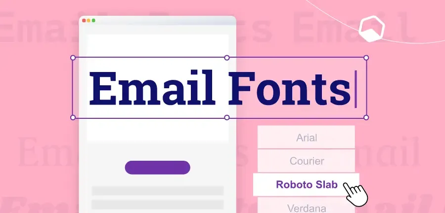
What Is Email-Safe Fonts and Why They Matter
Mail-enabled fonts are fonts that appear correctly on most email clients and devices. These fonts already exist in Windows, macOS, iOS, Android, etc. Mail clients load these without additional downloads or CSS support. Using unsupported fonts replaces mail clients with fallback fonts. This substitution often changes the character interval, line break position, and layout, and may cause the appearance of emails to become poor or difficult to read.
Common Email-Safe Fonts You Can Trust
Selecting the right font enables professional and readable email across all devices. Widely supported by major email clients such as Gmail, Outlook, and Apple Mail, fonts are a secure option to ensure consistent delivery. These fonts allow you to avoid unexpected fallback problems, retain layouts, and maintain your brand's visual identity. Most system fonts work reliably in the inbox:
Sans-serif email fonts
- Arial
- Helvetica
- Verdana
- Trebuchet MS
Serif email fonts
- Times New Roman
- Georgia
Monospace email fonts
- Courier New
These fonts are consistently displayed on Gmail, Outlook, Apple Mail, and mobile mail apps. We also support reliable delivery because the mail client does not block.
Why Font Choice Matters in Email
The font plays more than just a character display. It affects the way readers recognize and engage with email. Selecting the right font ensures message readability, brand awareness, and email performance on any device. Improper font selection can lead to fallback font mismatch, layout disturbance, and lower engagement. Careful selection of email-enabled fonts and appropriate sizes improves user experience and click rates to maintain email effectiveness and professionalism.
1 Consistent Readability
If the fontfailsto load, it may be automatically switched to a fallback fontthat looks very different. This discrepancy disrupts the visual flow of mail and confuses the reader. Consistent readability allows readers to easily grasp messages without interruption. The use of email-enabled fonts unifies the appearance of text, regardless of device or email client, keeping content clear, professional and readable.
2 Stronger Brand Presence
Even when using system fonts, you can enhance your brand identity by paying attention to size, spacing and hierarchical structure. Headings, body, and CTAs do not depend on custom fonts and can consistently reflect brand styles. This consistency allowsreadersto instantly recognize emails, build trust, and feel connected to brands. Properly selected fonts convey a professional impression, make it easier to remember, and enhance brand awareness with all emails you send.
3 Better Engagement
Easy-to-read mail reduces friction and encourages readers to engage with content. Clear and appropriate fonts allow usersto quickly look through emails, focus on points, and easily click links and buttons. Inappropriate font selection reduces engagement by making emails clutter or less readable. The use of appropriate fonts keeps readers interested, improves overall click rates and increases campaign effectiveness.
4 Mobile Optimization
More than half of mail openings are done on mobile devices. Decorative fonts that are too thin and small are cramped and hard to read on small screens, and damage the user experience. By selecting a mobile font, you can maintain the readability and visual balance of emails on your smartphone or tablet. Optimized fonts enhance scanning, better understanding, higher engagement, and support stable campaign performance on both desktop and mobile platforms.
How Email Clients Handle Fonts Behind the Scenes
Email clients are different from web browsers. Many clients delete CSS rules, ignore font imports, and block remote resources. In particular, Outlook uses Microsoft Word as its rendering engine, limiting font support. Because of these limitations, email typography needs to focus more on reliability than visual diversity. Secure font fallback protects your design when custom fonts are not available.
How to Use Safe Font Fallbacks Correctly in Emails
Not all fonts are displayed correctly in all email clients. A font fallback system should be planned to prevent layout problems and maintain readability. Fallback keeps emails professional and readable, even when preferred fonts are not available. If the first font fails, the following fonts are automatically loaded: Proper fallback chain stabilizes design.
Best Practice Font Order for Emails
- Main brand fonts or web fonts
- Visually similar system fonts
- General purpose font family (serif or sans serif)
Example of a Safe Font Stack
Font-family: 「Open Sans」, Arial, Helvetica, sans-serif;
If the web font fails, the system font will take over. If it fails, the generic family is loaded.
This approach protects delivery and layout regardless of mailbox.
Email Typography Best Practices That Always Work
Excellent typography makes email easy to read, professional and attractive. By following fontsize, line-to-line, heading, and button best practices, email content is displayed correctly on any device. Appropriate typography improves understanding, understanding, and click rate of content.
By applying these practical rules, you can create emails that keep your brand consistent, work effectively on both desktop and mobile, and provide readers with a comfortable reading experience. Excellent mail typography follows clear rules. These rules focus on readability, space and structure.
Body Text Size for Emails
The body text size of 14-16px is ideal for readability (especially on mobile devices). Too small characters force readers to enlarge and excessive scrolling, thus reducing engagement. With this size, most readers can read content comfortably without tiring their eyes, keeping your email professional and user friendly. Balancing space efficiency and clarity makes it easy to scan and understand messages.
Line Height for Comfortable Reading
Lines control the space between text lines. The 1.4 to 1.6 range improves clarity and reduces the impression that the letter is clogged. Properspacing improvesthe readability of emails, especially in long paragraphs. It also enhances the ease of scanning and helps readers find important information quickly. By using consistent line height throughout the mail, the layout is organized, preventing the impression that the contents are cluttered and overwhelmed.
Clear Heading Hierarchy for Emails
Inducing readers by size difference:
- H1: 22–28px
- H2: 18–22px
- H3: 16–18px
A clear hierarchical structure helps readers understand the structure without additional design elements.
Optimal Line Length in Email Layouts
45 to 75 characters per line.
Long lines make eyes tired, short lines unnatural. Balanced line length improves readability.
Buttons and Call-to-Action Text
- Minimum size: 14 ~ 16px
- Use bold text
- Maintains strong contrast between text and background
Clear CTA text improves tap accuracy on mobile devices.
Avoid Ultra-Thin Font Weights
Ultra-fine font weights such as 100 and 200 often cause poor display on Outlook and mobile screens. It is distorted and visible, decreasing readability. Use middle or bold weightsfor headings and body text to maintain clarity, visibility and professional appearance across all devices and email clients
Recommended Email Font Pairings That Render Reliably
Selecting the right font combination improves email readability, style and brand consistency. Use fonts that are compatible with headings and body text to organize content on any device and maintain a professional and visually attractive look.
Carefully combined fonts guide readers to messages, emphasize important information, and maintain consistent tones. The following are practical combinations that can be used in various types of mail to achieve a clear and professional look. Font combinations improve structure without increasing complexity. Please limit fonts to only two types.
Pairing A: Clean Marketing Emails
- Headline: Georgia
- Body: Arial
This combination is clear, classic and widely compatible with most email clients. Georgia keeps headings strong and readable, while Arial keeps text simple and clear. Clarity and professionalism are ideal for marketing emails, newsletters and promotional messages. It balances style and readability, making it easy to scan content and visually consistent across devices.
Pairing B: Modern Tech Feel
- Headline: Helvetica or Arial Bold
- Body: Verdana
With a sophisticated minimalist look, it isideal fortech brands and modern product launches. The bold Helvetica or Arial headings stand out, and Verdana ensures body text readability on all screens. Sophisticated lines and simplicity make mail look modern without compromising clarity. A perfect combination for concise, information-driven emails that prioritize modern design and easy scanning.
Pairing C: Editorial / Newsletter Style
- Headline: Georgia Bold
- Text: Georgia or Times New Roman
Perfect combination for newsletters and long-text content. The Georgia Bold headline builds a powerful visual hierarchy, and the body of Georgia or Times New Roman provides readability like a magazine. This combination guides readers with long content, improves scanning and gives email a professional and sophisticated look. Especially effective when you want a classic editing style that maintains both readability and brand personality.
Web Fonts in Emails: What You Should Know
Some email clients support web fonts, but many do not. Frequently blocked on Gmail web apps and Outlook desktop versions.
When Web Fonts Make Sense
- Brand-driven campaign
- For Apple Mail users
- Design-focused newsletter
When to Avoid Web Fonts
- Transaction Email
- Sales Email
- Mass distribution marketing campaigns
Always prepare a safe fallback when using web fonts.
Accessibility Rules for Email Typography
Accessible typography improves the convenience of all readers.
- Contrast Matters: Ensure strong contrast between text and background. Light gray text on the white background reduces readability.
- Avoid All-Caps Body Text: Uppercase text reduces reading speed and puts a burden on the eye. Use only for short labels and buttons.
- Use Clear Spacing: Add space between steps. Dense text blocks reduce reading motivation and increase withdrawal rates.
Common Email Typography Mistakes to Avoid
Many email design problems arise from small mistakes.
- Use two or more fonts
- Set body text to less than 13px
- Write uninterrupted long text blocks
- Depends on CSS rules Outlook ignores
- Use custom fonts for key content
Avoiding these mistakes improves email delivery and reader reliability.
Testing Email Fonts Before Sending
Be sure to test your email before delivering it.Tools to help you test:
- Inbox preview tool
- Device Preview
- Manual testing on Gmail, Outlook and mobile apps
By testing, you can confirm that the font is displayed correctly and the space does not collapse.
How Typography Supports Brand Identity in Email Marketing
Typography shapesthe way readersrecognize brands. Consistentfonts build friendliness and trust. By following the same typography rules, the reader instantly recognizes the message.
Simple system fonts can support a powerful brand identity if used consistently.
Final Summary: Choosing the Right Fonts for Email
Effective email typography helps ensure message readability, professionalism and attractiveness. Choose a reliable email-enabled system font and set up the appropriate fallback for web fonts to stay consistent across all email clients. Optimize line-to-line,space and textsize for mobile devices to improve readability and scanning.The heading hierarchy is simple and consistent, allowing readers to easily follow messages.
Above all, let the typography play a role in supporting the content without disturbing it. Well-planned fonts enhance your brand, improve your user experience, enhance engagement, and help your email stand out in your busy inbox.